Important Factors that Help Build an Effective Mobile Website Design
Every other business and individual owns a website today. The market is extremely competitive than it was a few years back. Getting online to market any product, service, individual, brand and social cause is the best way. But it will only turn into a blessing when done with utmost perfection, dedication and by keeping doors as tightly closed as they could be for mistakes to hop in. Having only a Mobile Website Design will not make numbers until it is effective.
Building a website through a responsive designing technique will surely have a lower bounce rate than an unresponsive website and an effective responsive website design can extract more conversions from the total number of visits.
So it’s better to build a Mobile Website Design keeping effectiveness in mind and here are a few important factors to help the same:
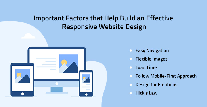
Easy Navigation
One of the most important Mobile Friendly Website Design Features found that converts well is clear navigation. Internet users who land on your site will quickly abandon ship in favor of a different search result if your website navigation is confusing.
While it’s true that a good first impression is critical, as we’ve discussed above, immediately after you have gotten a visitor’s attention, you must have a strategy in place to hold that attention. A visitor getting confused to roam around on a site will surely decide to leave that website for eternity.
A skillful responsive web development company knows how to map the navigation and where to put the navigation button for a great user experience.
Flexible Images
Images help to attract and hold visitors for long, but if they won’t scale according to the size of the device then they can work as a curse. Flexible images are a highly important and effective factor in designing a Responsive or Mobile Website. Also not to forget, the quality of the image should remain the same.
You need to think about how an image will scale as the images will work as an ingredient in your website dish. Even Mr. Ethan Marcotte – The fellow, who started the whole responsive design thing, also mentioned using flexible images in his article on A LIST APART. Consider scalability, how will it look on a desktop screen vs. a tablet vs. a small mobile screen? From a development perspective, the code will allow images to scale via a percentage value to the width of the browser window.
Load Time
It is the time a website takes to load on a web browser. A website should load quickly, irrespective of the device, it is being surfed on. That’s why the effectiveness of a fully responsive web design is important. The faster the loading time, the best web user experience you can give. Nobody has time in this speedy world and hence websites are expected to load fast. Loading time is very important in valuing the time of your targeted customer. Your website represents your brands and responding quickly to a customer query is important.
Slow loading could leave a negative impression of your business and the visitor can leave your website in search of another. Users may even assume that the system you are using is outdated and no one will opt for anything outdated.
Let’s Dig Deep into “8 Tactics for Better Hand on Website Speed Optimization”
Follow Mobile-First Approach
The mobile-first approach is a technique of Responsive Website Designing where the development process, including coding, designing, coloring, etc. is done for the mobile devices primarily and afterward made scalable for the desktop or laptops.
Using the mobile-first approach is a helpful factor because the majority of web surfing is being done on mobiles in comparison to desktops. Small screen devices are the reason which gave birth to the idea of responsive designing and mobiles are the most selling small screen devices. Mobile-First responsive web design will surely prove its worth for effectiveness.
Know More about “Mobile First Website Design & Responsive Website Design”
Design for Emotions
What drives humans to the core is “Emotion”. Almost all the television and digital media commercials are made to touch any of the many emotions of people.
To extract positive and emotional reactions to your site, work to build a website that includes memorable elements, fun, and share-worthy. How you shake this emotional reaction will depend on the needs and wants of your website’s purpose along with its target audience. Many companies know how to inject an emotional touch on any website while providing responsive website design services. Consider consulting one.
Hick’s Law
Responsive or not, but the implementation of Hick’s law has always proved its worth in conversations of website effectiveness. According to this law, the more options a person has, the longer time he/she will take for decision making.
A website is considered as effective only when it yields results which it was made for. Whether your target audience is visiting your website on desktop or mobile, it will always be comforting for them to choose from fewer options. Limit form fields, CTA’s, and menu item precisely. Stick to only one goal per page.
Info Fact – Implementing Hick’s law doesn’t mean cutting off the necessary things.
Final Words-
If you want to mark your long-lasting presence on the digital front, then building a website of an effective and responsive nature is a must. Always try to be superlative, unique, and real. Responsiveness and effectiveness work only when the website has traffic and for that comes SEO. Don’t hesitate to get in touch with Digital Website Development for any kind of website Design Development and Marketing work. We offer the best Website Design Services in New Jersey.