
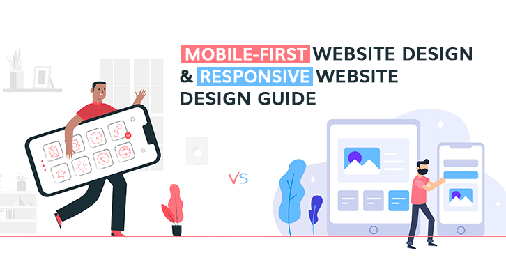
Mobile First Web Design & Responsive Website Design Guide
For most of the digitally unaware people, it might sound bizarre to differentiate between Mobile First Web Design and Responsive Website Design, however, both have their features and work process. The time has changed and the web world has taken a new turn, the landscape has been changed completely. Smart Mobile Devices are doing what they were introduced for and people find it easy and time-saving to search a query over search engines via mobiles.
Let’s start by disparage these jargons to attain a clear thought and to figure out which will be best suited for your brand. But before that, you should know both the basis-of-discussion terms engage with the word ‘Responsive’ which describes the capability of websites to shape their layout according to the size of various output devices.
What is a Mobile First Website Design?
The mobile First Designing process is exactly what it sounds like: starting to design for the smallest digital screen and working your way up for the big ones. Similar to designing a mobile app, every element of designing and layout process works to gain an exceptional mobile user experience. It is an approach that puts mobile-first. This concept professes that a small screen version/mobile version should be the base of designing strategy and must consider browsing behavior and experience of users on mobile devices.
This design technique results in a more focused and clean design and is easy to transform into a PC design. Following a quite different approach, Mobile Friendly Web Design rests its focus on how to deal with content. Rather than focusing on effects and animations, it considers the best display of content deliberately. Once the mobile design questions are answered, designing for other devices will be easier.
Pros and Cons of Mobile-First
The Pros:
- By using the Mobile-first approach, you are targeting a larger section of the population as around 68 million Google searches are made every day through mobile devices on a world level.
- Content is King and that’s what Mobile-first follows. It eliminates excessive design elements and makes way for the content to connect with the user.
- Targeting the “on-the-go” lifestyle of modern people, it helps businesses to act in keeping the future in mind.
- Make your websites look smart and neat. Encourage you project what matters to the users and boost loading speed.
- Simplification of coding in a website designed via mobile-first approach leaves fewer scopes for bugs to enter.
The Cons:
- As the process starts by keeping mobile devices in mind, it becomes difficult to imagine the overall desktop look of a website.
- Clients want to see the demo of their websites before agreeing on the design and they want to see it on larger screen. Hence mobile-first design strategy keeps clients on a long hold.
- Developers have to create two isolated SEO strategies for a Mobile website and Desktop website.
- Limitation of space is the biggest problem which forces to cut down on creativity.
What is a Responsive Website Design?
Responsive Website Design is a technique/approach of designing a website in such a manner that makes its web pages interpret well on a variety of devices such as desktop, laptop, tablets, and mobiles. The practice of responsive designing consists of a mix of images, layouts, and flexible grids. Crafting a responsive web design with HTML5 and CSS3 media queries intelligently boost the responding capacity of the website accommodating its resolution and scripting abilities as the users switch from their laptops to smartphones.
Talking about a conventional “fixed” website, at the point when seen on a computer, for example, the site may indicate three segments. But when accessed on a smaller screen, it may push user to scroll horizontally which is not suitable for person using mobile devices. That’s where companies providing Responsive Web Design Services finds their business scope.
With a responsive design, websites can be browsed from any device and it will still look, communicate, and function perfectly.
Pros and Cons of Responsive Web Design
The Pros:
- In comparison to mobile-first, responsive web design is more helpful in saving design and development costs.
- Using a responsive approach eliminates the need for developing a separate mobile website.
- Useful for the kind of heavily stuffed informative and e-commerce websites.
- Having a responsive website also facilitates easier and greater SEO implementation as there is no need to create independent content for the mobile version.
- One URL makes it easy for users to interact with the website without facing the hassle of redirection.
The Cons:
- Responsive websites take a bit more time to load due to complex coding and visuals of flexible sizes.
- Forces developers to drop some cool and creative design ingredients on pages due to their inability to distribute well on mobile devices.
- As everything is done keeping various devices in mind, responsive design takes a longer time to develop.
- Because of some relative positioning in responsive designing process, implying certain effects can be challenging.
How to decide between Mobile First and Responsive Web Design for your business?
Just like many other decisions of business, it also depends on your targeted audience. It is advised to put some resources on surveying to find out the majority between mobile users and desktop users. If the greater side of your targeted audience prefers mobile then you should go for the Mobile-First approach or vice versa. In any case, don’t forget to consult with experts. Approaching a Responsive Web Design Company or Mobile-First Company can make a significant difference before landing on any decision.
Keep in mind that most of the visitors will not differentiate between a mobile-first website and a responsive website. They will review your website on its ability to communicate, interact, attract and navigate on the ease of them.
Wise Note: Whatever you choose, a better user experience is the key to quantitative conversions.